Pages

dimanche 18 mars 2012

Itsuko Hasegawa

Itsuko Hasegawa is a Japanese architect.
She was born in Shizuoka in 1941, she studied architecture at the Kanto Gakuin University (1964), formed by Kiyonori Kikutake until 1969, then studied and worked at the Institute of Technology in Tokyo. In 1979, she founded her own architectural firm, Atelier Itsuko Hasegawa, that many achievements have been recognized in Japan and abroad.
She realized the Yamanashi Fruit Museum, the Shonandai cultural center, the Sumida Culture Factory ...


Yamanashi Fruit Museum
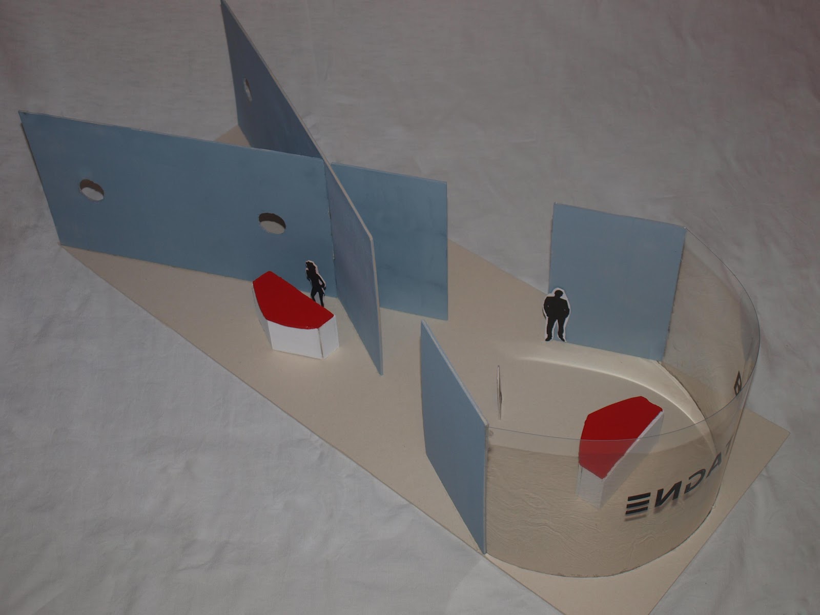
Itsuko Hasegawa designed the Fruit Museum in the Yamanashi Prefecture near Mount Fuji in Japan, it was completed in 1997. The three shell-shaped buildings symbolize the "fruits" of spiritual sensuality, intelligence and lust. As an expression of contextual ecology, white light shines through screened structure in a paradisaical green house.


What I love about this work it is the large and round glass structure which reminds me of a giant snail. The inside of the structure is completely illuminated by these windows, we must feel like in a bubble. -Eugénie-


This work is interesting by its shape and the light. -Laure-

J. MAYER H.

Jürgen Mayer Hermann is a german architect and designer. He was born on the 30th October 1965. He studied in the Stuutgart University, The Copper Union in New-York and Princeton University.


He founded " J. MAYER H. Architects " in 1996 in Berlin. The main preoccupation of his work is the relationship between the human body, technology and nature form for a new production of space.


He won some awards, national and international, like the Mies-van-der-Rohe-Award-Emerging-Architect-Special-Mention-2003 for example.


A J. MAYER H.'s project that we really love is Dupli.Casa.
It was built between 2005 and 2008 near from Marbach in Germany. The implantaion of this house is based on the footprint of the previously house which was dated from 1984.
This villa is composed of 3 levels. The lines of it seems to be infinitely so we don't see the limit between the house and the garden. There is not a contrast with the shapes of the house but there is a contrast with the colours. Inside and outside are both based on a black and white contrast. Light only creates a shhaded off.Every room is turned towards the forest with a specific point of view. In this way, every window becomes a frame.


I like this house because in every view I have the impression that is a new house : sometimes I can see 2 levels, the others times there are 3 levels. The nature is very important in this project.  The colours come from outdoor and with the large windows people can feel like they are out. 
-Laure-


Me what I like in this house it's its complexity and at the same time its pure forms only in white and black. -Eugénie-


DUPLI.CASA - Villa MRMM near Ludwigsburg, Germany


DUPLI.CASA - Villa MRMM near Ludwigsburg, Germany

DUPLI.CASA - Villa MRMM near Ludwigsburg, Germany

DUPLI.CASA - Villa MRMM near Ludwigsburg, Germany


All these photos come from the website of J. MAYER H.


http://www.jmayerh.de/

Scenography

This month, we have to work on a stage design. This area has to represent Brittany by shapes, materials, colours or anything else.


With this project we learned some security obligations because the stand has to welcome a lot of visitors and has to be evacuate quickly. Materials are subjected to standard too.


Regarding the project, I wanted to emphasize that Brittany is the region that has the most kilometers of coast. So I worked on the contrast between the sea and the earth and particularly the verticality of the earth and the curves of the sea. I decided to use wood for earth and glass for sea. Glass is very important because the light of the stand comes from it and videos too. And then,  visitors can really feel like if he was in Brittany with the changeable light of the weather. -Laure-


Regarding my project, I have chosen to inspire me sailors knots, particularly the figure of the eight. Seen from above, it also recalls the infinity symbol interrupted. Which refers to the ocean, we nerver see where it stops. For the colours I choose blue-grey to symbolize a turbid water red and white refer to the design of boat. -Eugénie-   

Hello !

We are two people who are studiing at LISAA, a college of applied arts.


We created this blog for our English class. It is dedicated to the arts, we will talk about architect's projects and designer's projects that we love and our own projects.